Jacob Morrow
Updated: 2026-11-03
A new user opens your app with one practical question: “Can this help me do what I came for?” A useful first result answers it faster than a tour of six features.
App onboarding guides someone from first open to that first meaningful outcome. For a budgeting app, that might mean connecting an account and seeing the first categorized spending summary. Registration, permissions, tips, and welcome messages support the journey when they help the user reach that result.
This guide shows how to choose the outcome, remove avoidable friction, learn from documented mobile app onboarding examples, and help users resume a task when they leave partway through.

What Is App Onboarding?
Mobile app onboarding covers the product experience that helps a person become ready and able to complete a meaningful task. Depending on the app, that may include signup, verification, initial setup, contextual guidance, and feedback after the first action.
A completed welcome carousel measures progress through the carousel. Activation needs a product event tied to value. Onboarding can also return later as a short, contextual explanation when an existing user meets a redesigned workflow or unfamiliar feature.
How to Design an App Onboarding Flow
Start with the result, not the screens. If the team cannot agree on the first useful outcome, each department tends to add its own request: create an account, select interests, enable notifications, watch a tour, complete a profile. The flow grows, but the user's reason for opening the app gets buried.
 Illustrative scenario
Imagine a budgeting app. Its first-value milestone is viewing a categorized summary after connecting an account. In a learning app, it could be completing the first lesson; in an ecommerce app, finding a relevant product.
Name one observable outcome
Choose an action that demonstrates value in the product, such as
first_summary_viewed. “Finished onboarding” is too vague unless finishing the flow itself produces the value.Map only the necessary path
The budgeting app may need consent, an account connection, and a successful data sync before it can show the summary. A profile photo and notification preference can wait.
Mark likely friction
Bank selection, credential handoff, verification, slow syncing, and an empty result are different problems. Track them as separate steps instead of treating every exit as generic abandonment.
Give useful feedback
After a connection attempt, say whether it worked, is still processing, or needs another action. A spinner without context makes a technical wait feel like a dead end.
Stop onboarding when the result is clear
Once the first summary appears, let the user explore it. Introduce budgets, alerts, and reports when those features become relevant rather than extending the first-run sequence.
Separate what is essential now from what can wait
Some apps can let people browse, calculate, or create a draft before signup. Others handle money, health data, or private workspaces and need identity or verification before the core task. The right sequence follows the product's risk and data requirements.
A useful test: For each step, ask what breaks if it is delayed. Move optional work after first value. When a step is required for security, regulation, or the product to work, explain why and keep the next action visible.
App Onboarding Best Practices That Reduce Friction
“Keep it simple” sounds sensible, but a designer needs a sharper test: which step helps the user move forward now? A longer flow can still feel reasonable when every step is necessary and progress stays visible.
Teach through the core task
Let users perform a safe, real action instead of describing five controls they have not needed yet. Apple’s onboarding guidance recommends interactive learning and context-specific tips when onboarding is necessary.
An empty state can do much of this work. Rather than showing an empty chart with “No data,” explain what will appear, offer one clear action, and include a sample only if it cannot be mistaken for the user's data.
Reveal detail when it becomes useful
A feature tour assumes the user can remember information before having a reason to use it. Progressive disclosure changes the timing: show the bank-connection explanation beside the connection step, the category-editing tip after the first summary, and the alert option after the user has something worth monitoring.
Interactive, contextual, minimal, tutorial, and personalized onboarding can work together. A flow might begin with a minimal choice, become interactive during the core task, and personalize the next step after the user states a goal.
Ask for data and permissions in context
A user who has just scheduled a reminder understands why notifications may help. The same request on first launch has no such context. Apple advises requesting notification authorization when people can understand its purpose. Android similarly recommends asking for runtime permissions when the user starts interacting with the feature that needs them and allowing an educational explanation to be cancelled.
A pre-permission screen can explain the benefit and the consequence of declining; the operating system prompt then records the user's choice. Preserve the rest of the experience where possible and provide a clear way to revisit the setting later.
Make guidance skippable, accessible, and localizable
Make optional tours easy to skip and reopen. Complex products benefit from guidance placed beside the task where it becomes useful.
Test the flow with larger text, screen readers, keyboard or switch navigation where applicable, and translated copy. A button label that fits in English may wrap in German; a progress cue based only on color may disappear for someone who cannot perceive that distinction. Plan for those conditions while the flow is still easy to change.
What Can You Learn From App Onboarding Examples?
The most useful examples reveal a design decision, not just an attractive screen. The three flows below come from official product or help material; exact screens can still vary by platform, region, account state, and product updates.
Wise: make a high-stakes first task transparent
Wise's official first-transfer guide describes a mobile flow that moves from recipient and amount to payment choice and final review. It shows fees and estimated arrival times before the user confirms the transfer.

For products that handle money or sensitive decisions, clarity is part of onboarding. Show the cost, status, and next commitment at the moment the user needs them, while keeping required identity and verification steps visible.
Duolingo: help learners start at the right level
Duolingo's May 2026 official course setup guide shows learners choosing a starting level before entering a course. A beginner can start with the basics, while someone with prior knowledge can take a placement test and skip material they already understand.
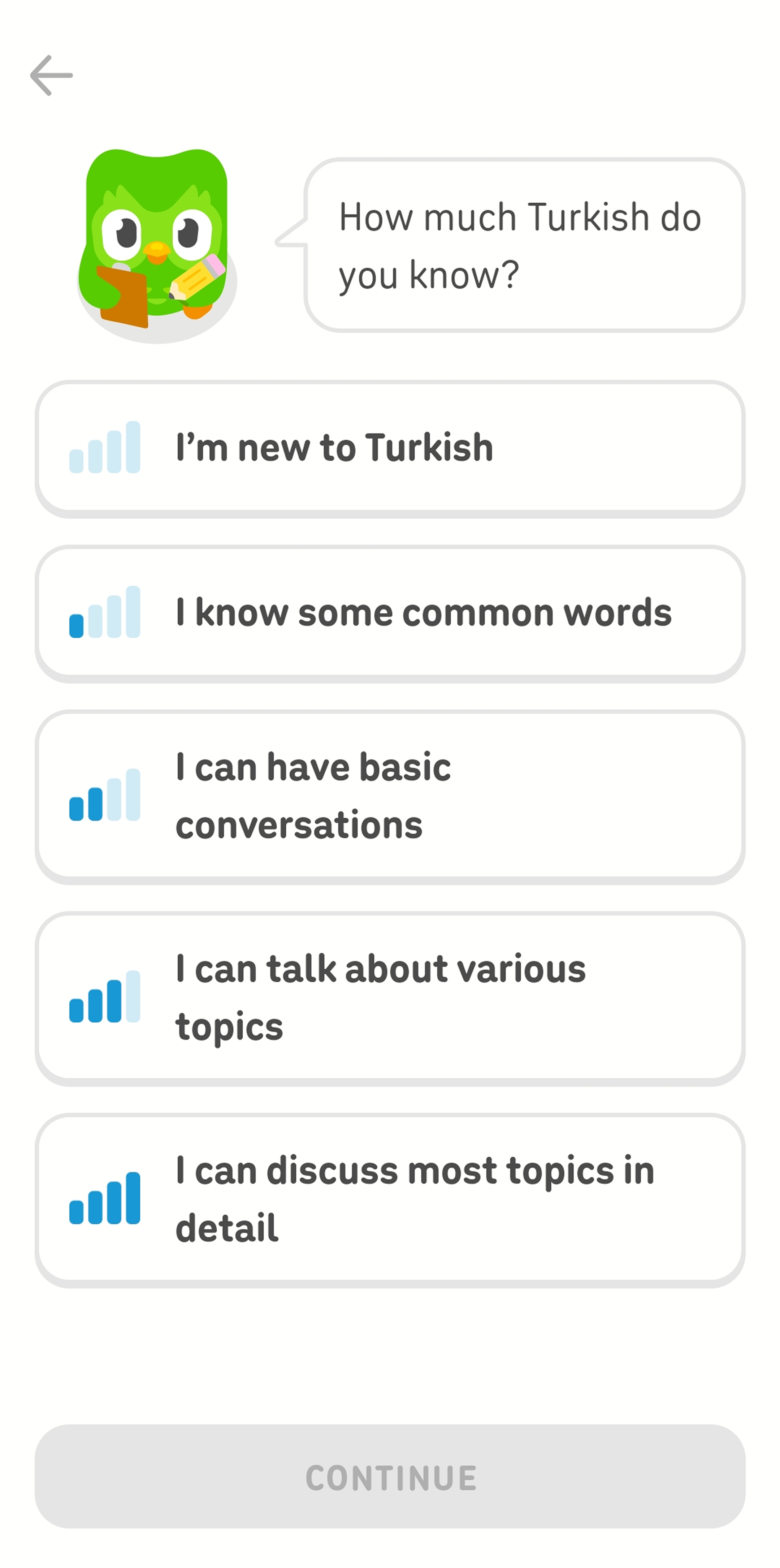
The lesson for onboarding teams is to use existing ability to choose a sensible starting point. This shortens the path without forcing every user through the same introductory material.
Headspace: place eligibility before personalization
In the specific enrollment flow for eligible Kaiser Permanente members in supported regions, Headspace starts from the member portal, authenticates eligibility, connects or creates an account, and then asks short questions to personalize the experience.
This sequence handles access before preference. Teams with eligibility, entitlement, or regional requirements can apply the same ordering: establish what the user can access first, then tailor the experience within those boundaries.
How to Measure App Onboarding Performance?
Decide who you are measuring, what success looks like, and how long users have to reach it. A rising tour-completion rate can look encouraging while activation stays flat.
For the illustrative budgeting app, success might mean: “An eligible first-time user who began account connection viewed a categorized summary within 24 hours.” The rate is the number who reached that result divided by all eligible users who began the connection step.
| Metric | Define it clearly | What it helps you decide |
|---|---|---|
| Step conversion | Users who complete a step ÷ users eligible to start that step. | Which transition needs closer inspection. |
| Drop-off | Eligible starters who do not reach the next step within the chosen window. | Where to inspect errors, effort, copy, or waiting states. |
| Time to first value | Time from a defined start event to the activation event, reported for the same cohort. | Whether the path became faster or merely moved work elsewhere. |
| Activation rate | Users who fire the product's activation event ÷ the chosen eligible cohort. | Whether more users reach the meaningful outcome. |
| Later retention | Activated and non-activated users who return in the same later window. | How continued use differs between the two groups; a controlled test is needed for a causal conclusion. |
Pair numbers with observation. Review error logs, support contacts, usability sessions, and session replays where lawful and appropriately disclosed. If users pause at bank selection, the answer may be missing coverage—not weaker button copy.
When testing a change, state it as a hypothesis: “Moving optional profile questions after the first summary may increase activation.” Compare equivalent cohorts and watch guardrail metrics such as verification failure, support demand, and later data completion. Judge the result by the product outcome alongside clicks.
How Can Messaging Help Users Resume an Unfinished Task?
With EngageLab Marketing Automation, your team can organize follow-up around what users have actually done instead of sending every new signup the same welcome sequence. The reminder can point back to a specific unfinished task and stop once the product reports completion.
That works best after the in-app obstacle is fixed and the return path is clear. For the budgeting example, a proposed workflow could look like this:
Enter on a meaningful incomplete state
The app reports an event such as
account_connection_started, giving the journey a more useful starting point than a generic first open.-
Wait for a reasonable period
Give the user time to finish naturally. Set the delay around the task, expected processing time, and urgency.
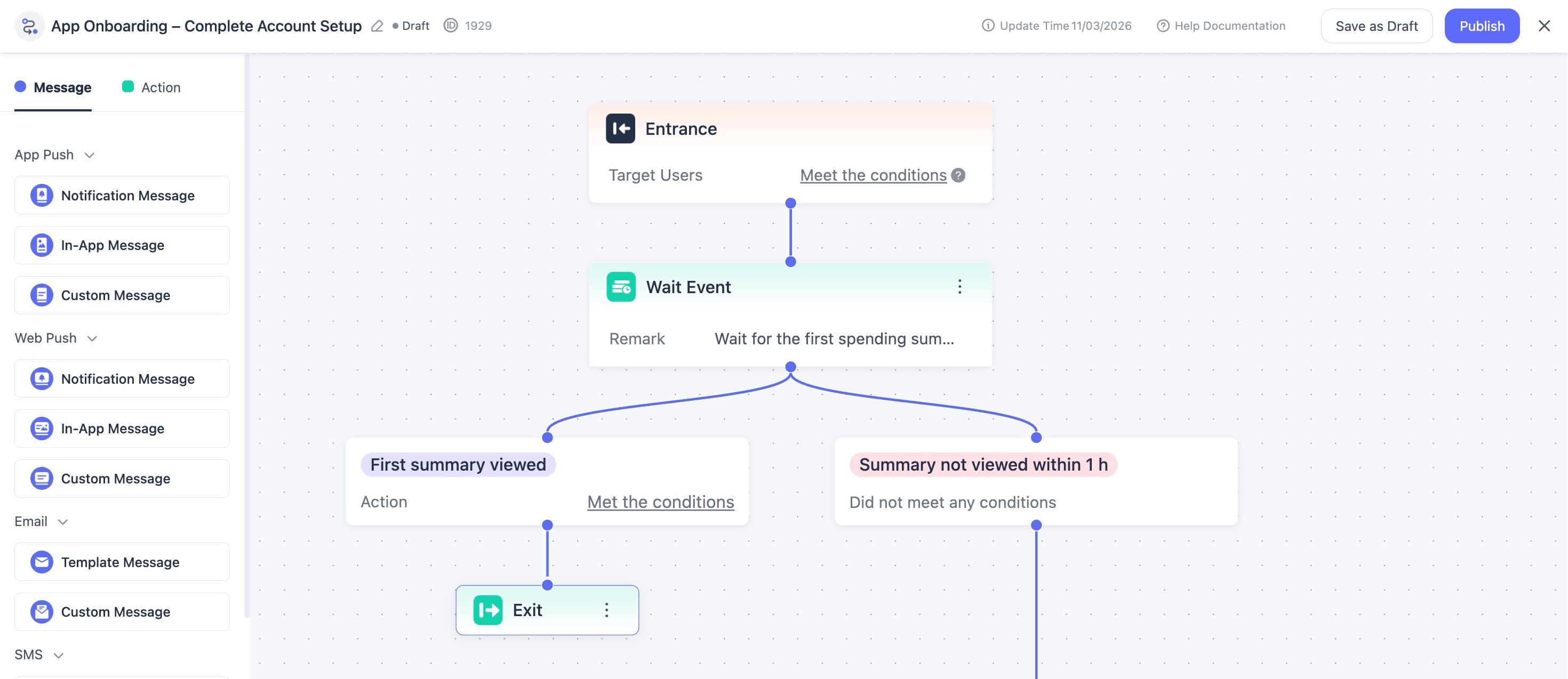
Entry and event-wait configuration in EngageLab MA.
-
Check the latest product state
If
first_summary_viewedoccurred, send the user to an end path. If account connection is still incomplete, the setup reminder may be relevant. Route connected-and-syncing and failed-sync states to their own updates.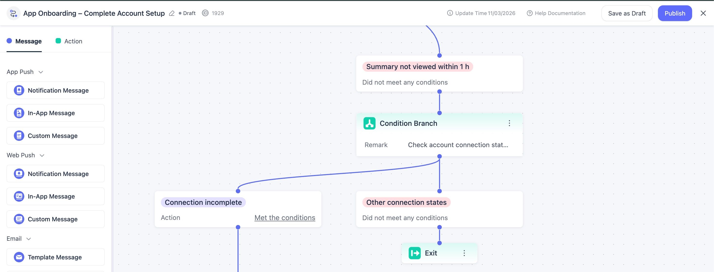
Account connection status check in EngageLab MA.
-
Use one suitable channel
For AppPush, send to an identified, reachable device with notification permission and a tested destination. Add another consented channel only when the user's context calls for it.
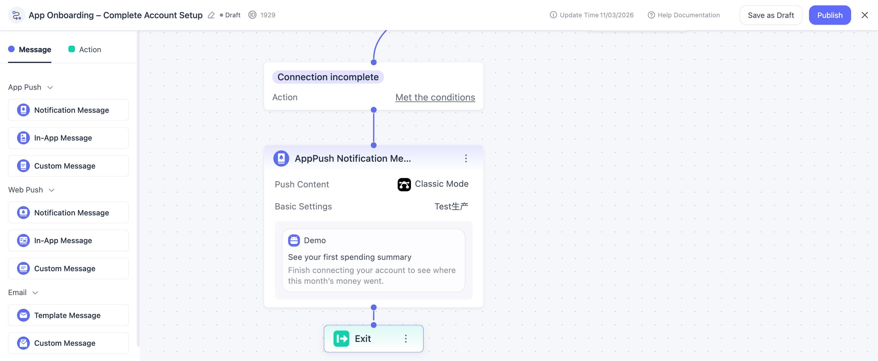
Onboarding push notification setup in EngageLab MA.
Measure completion in the app
Delivery and clicks describe the message. The product event shows whether the user completed the task, so keep both views in the report.


Example AppPush reminder:
See your first spending summary.
Finish connecting your account to see where this month's money went.
CTA: Continue setup
Send this example only when the latest product event shows that account connection is still incomplete. A user whose account is connected but still syncing needs a processing update; a failed sync needs recovery guidance. Give those states separate branches and suppress the setup reminder.
EngageLab Marketing Automation provides entry criteria, behavior triggers, wait components, messages, frequency controls, and end paths for this kind of journey. Its event management supports standard, recommended, and custom events, while user identities and contact details help the journey recognize and reach the intended person.
Before launch, connect the required product events and identities, configure EngageLab AppPush, confirm consent and notification permission, and test the return destination across common app states. The app continues to own its native screens, task UX, instrumentation, and error handling; EngageLab coordinates the follow-up around those signals.
Start With the Outcome, Then Remove the Detours
A stronger onboarding flow helps the right user complete the right first task, shows what happened, and makes the next action clear.
Pick one activation event. Map the necessary path to it. Measure each transition with a defined cohort and time window. Then use contextual guidance or a restrained follow-up only where it solves a specific obstacle.
Use product events to remind users about a specific unfinished task, then stop the journey when they complete it.